Who is Teranishi?
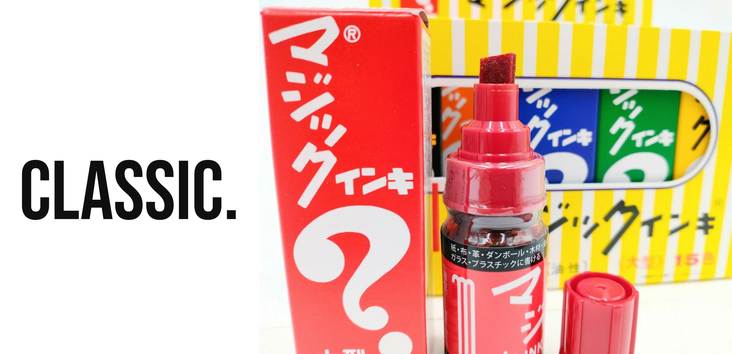
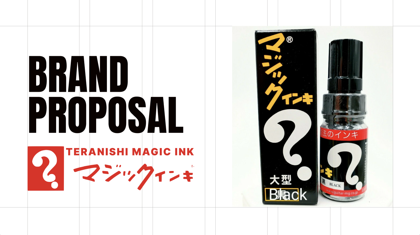
Founded in 1953, Magic Ink a premier product of Teranishi Chemical Industry Co LTD. While the marker is just one product of their diverse collection, the brand has earned acult following in street art for their reliability and signature style.
While Teranishi Magic Ink pens primarily only exist in North America on independent graffiti sites and small stores, the positioning of moving the brand into large-scale U.S. art stores would require a little pizzazz and a lot of strategy.
But how do we balance a new positioning with the brand’s extensive history? How do we make it stand out? How we get our audience to be invested in something so simple like a marker?

Goal of Campaign
To promote Teranishi Magic Ink Pens in a larger scale to their U.S. audience by creating a campaign with a release of their Magic Ink Pen Series sets through art stores across America. This will be the initial recognition of the brand on a large scale, broadening their current reputation to more artist channels with the goal of creating interest and brand loyalty from new consumers.
Message
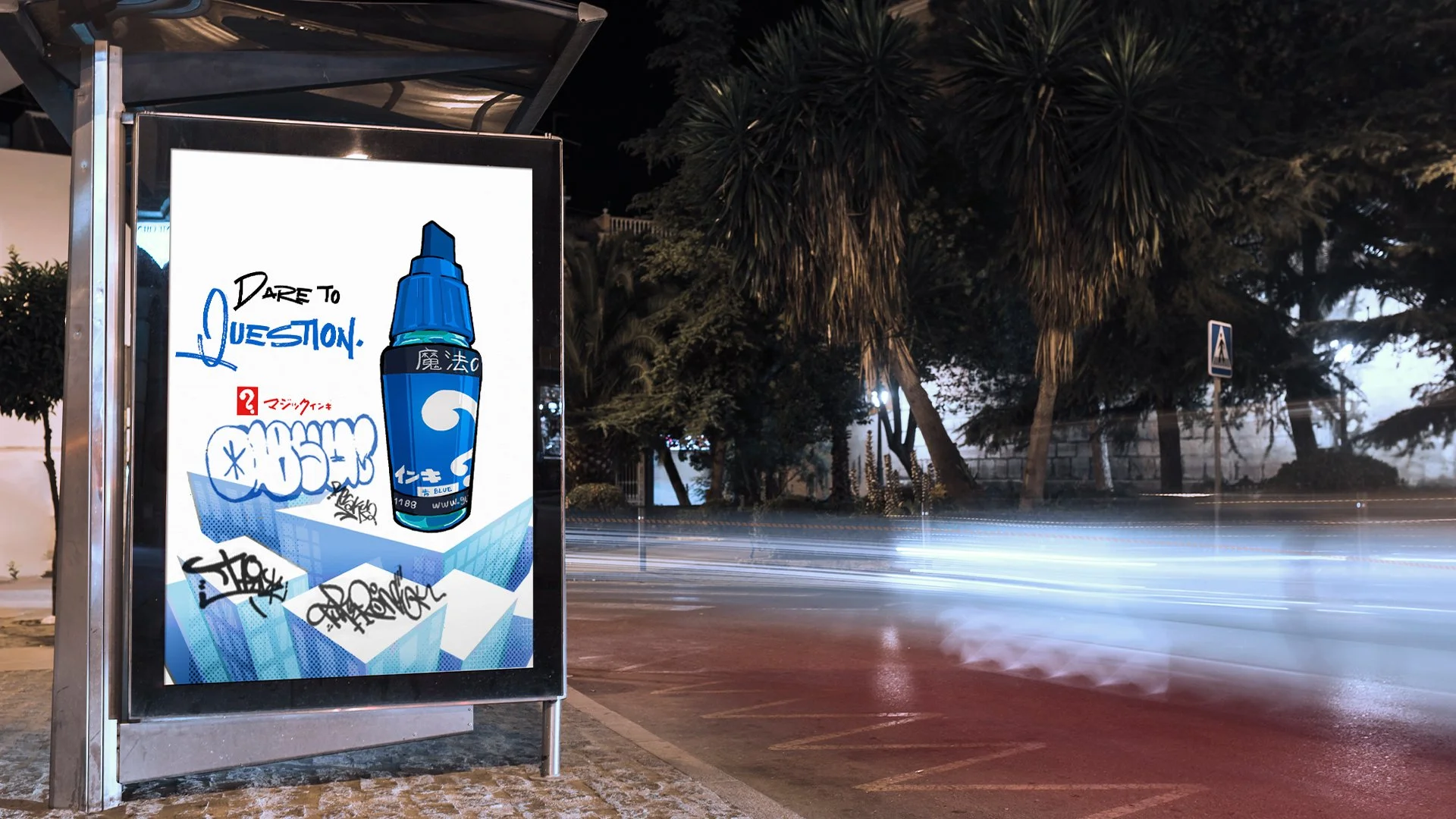
Teranishi Magic Ink can be used anywhere.
Mood
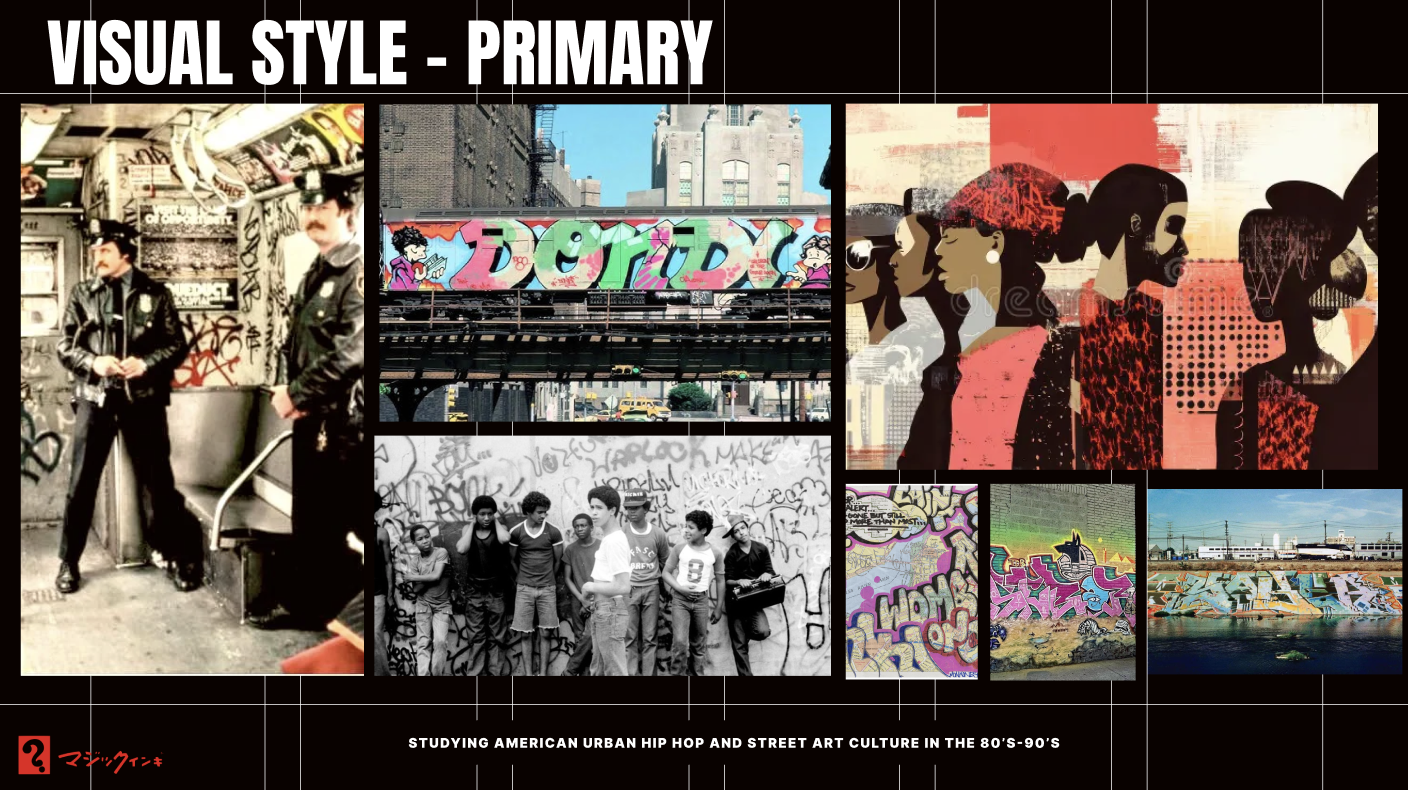
Vibrant, playful, and rebellious. We wanted our audience to feel inspired to create while also let them resonate with their defiant side.
Strengths
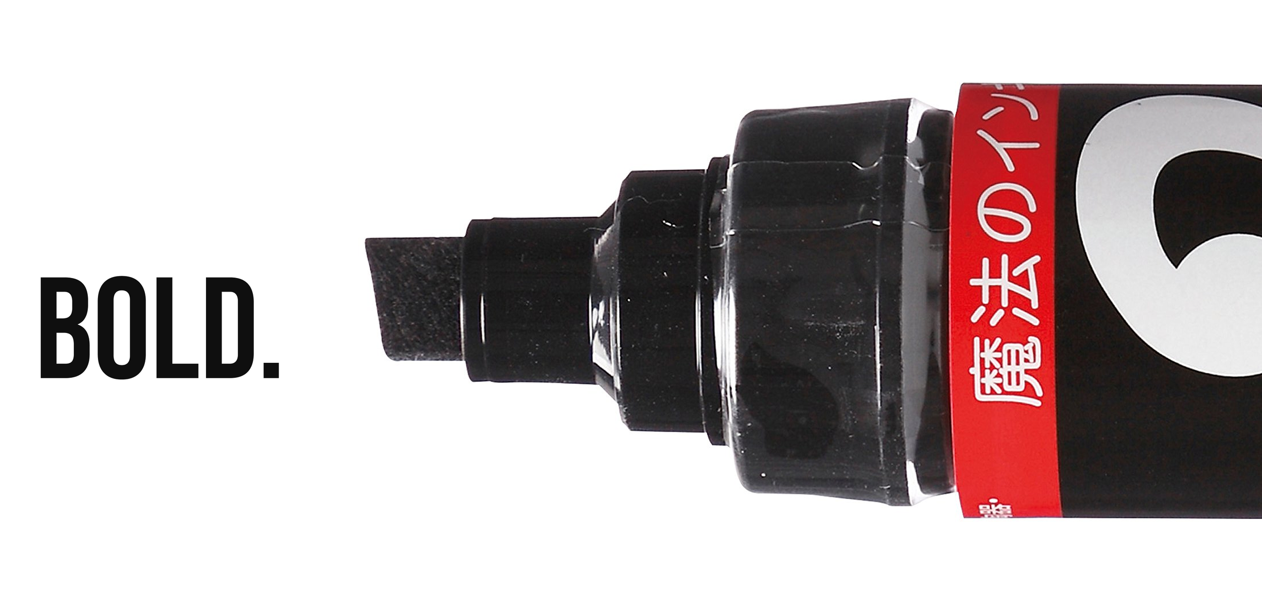
Historical presence, current positive reputation in small communities, uniqueness of packaging in competitive market.
KPI: Engagement, shares, build awareness, ROAS
Art Direction
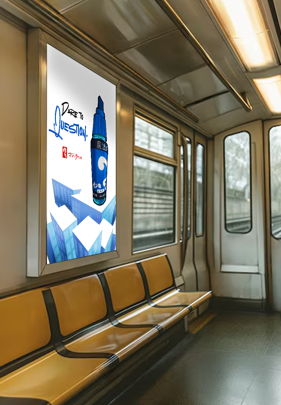
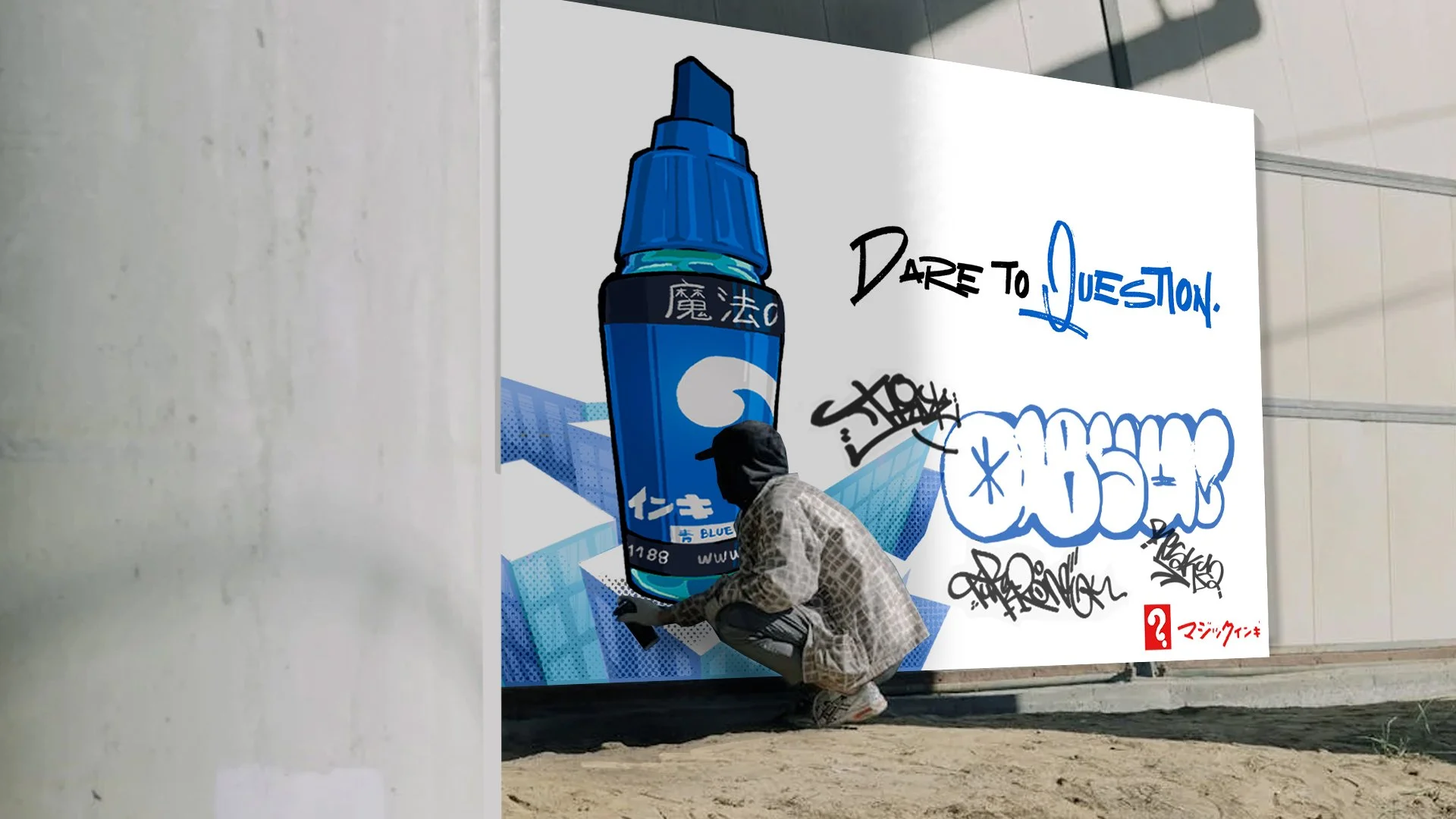
The composition is the primary aspect of this campaign, posing our “hero” (Magic Ink) taking a stand in the world. The visuals of the campaign are to let the artist is to see themselves as a superhero through the marker, giving them the courage to be bold and go beyond.
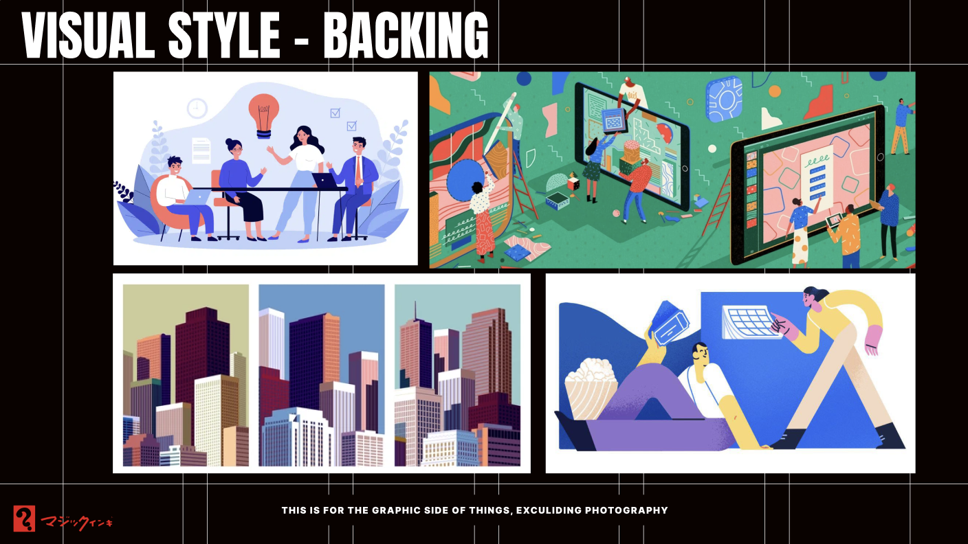
For the setting, choosing to go in a more corporate-friendly style worked to go against the marker’s style. In this, the contrast between the two makes a statement of defiance against the business-centered America.
It was also important for this project to optimize white and negative space within the styling, removing the rooftops and leaving as much “activation space” as possible for the audience to fill in the blanks.
Much of the design and typography referenced textures and settings from historically known street artists and tags, but also had roots within modern Japanese ad designs.
Other projects

Just incase this is the beginning of your journey through my work, here are some other cool projects I’ve worked on!