I was a featured Graphic Designer for the film

In short, I helped design some graphics.
Pretty descriptive huh?
I know, they should really give a name to that stuff.
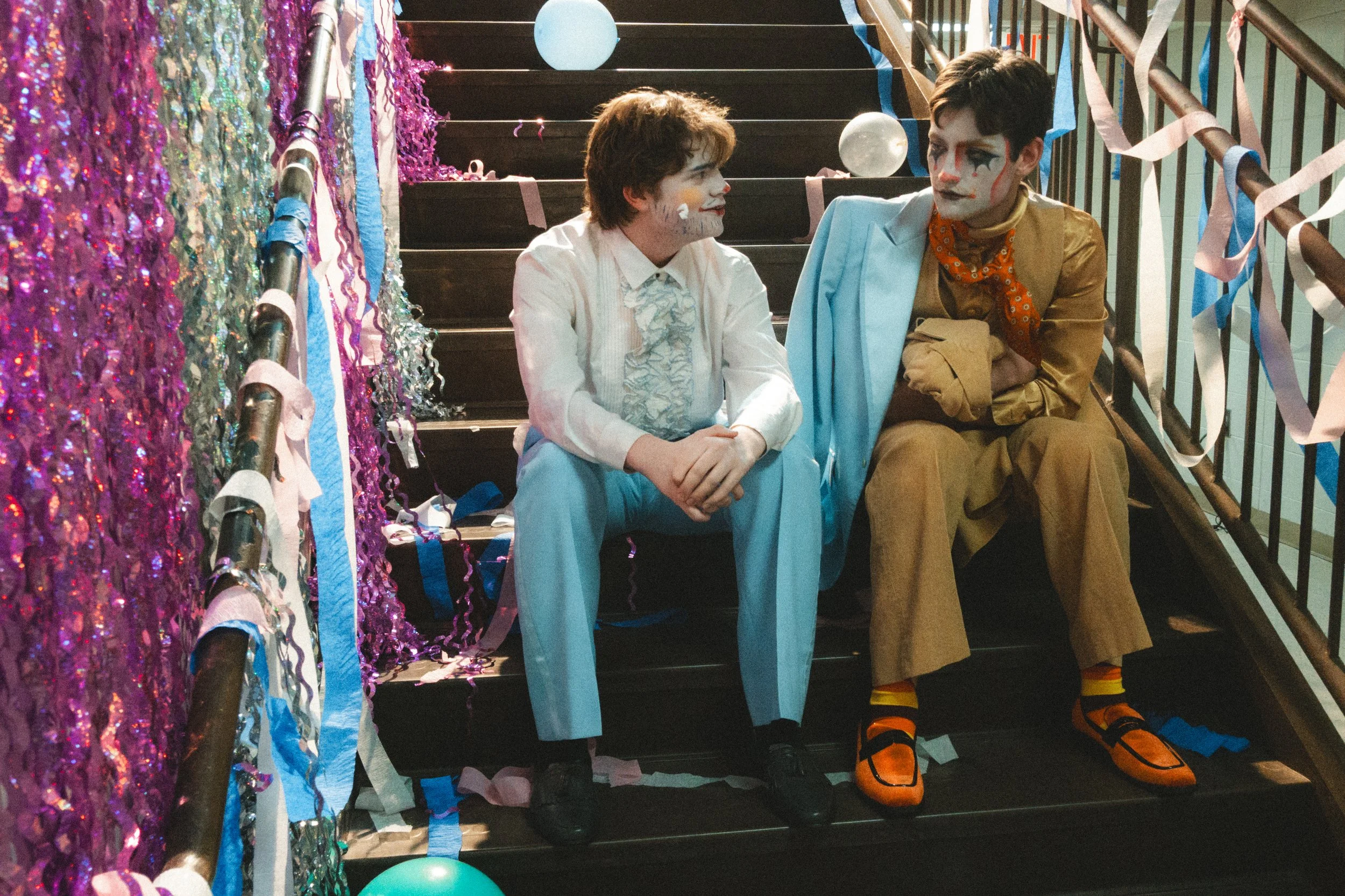
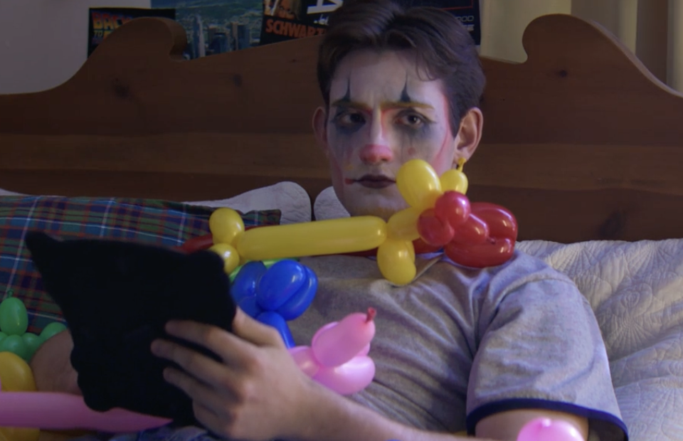
Credit’s Credits
Illustrations: Max Ritterpusch
Compositing: Max Ritterpusch
2nd Editing: Nix Pennington
Final Editing: Caro Chelen
Process
When Nix reached out to me to do some graphics for their end credits, I knew I wanted to go above and beyond. For these, everything was illustrated and edited in Photoshop by me before being worked in After Effects. In the end, the final bits of editing were done in After Effects, Media Encoder, and Premiere Pro.
Working on CLOM!
This experience has been one of the best creative projects I have ever partnered on! It was an honor to work with Nix and the team and be able to execute their vision based on their requests.
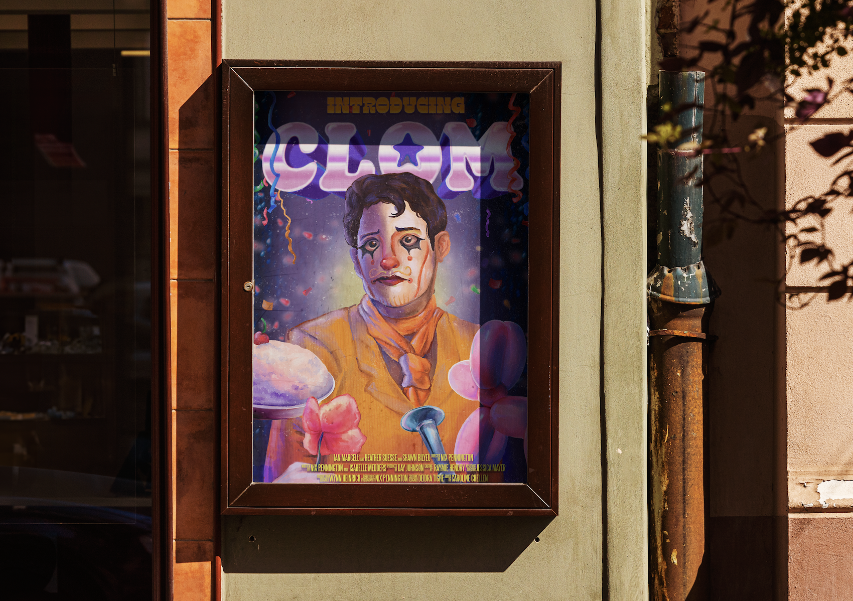
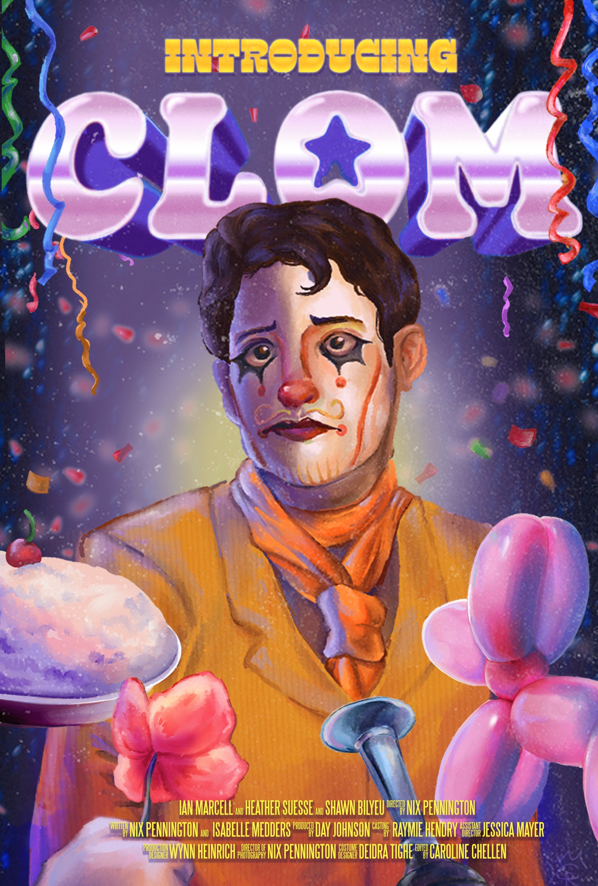
Doing graphics for the poster was very interesting, as it was fun to combine reference with the source material of the film. By using the concept of the original “Clue” movie posters in a similar painterly style, the final poster was rendered to be a comedically centered
For the credits, it was fun to piece together all the best parts of the movie and find a way to keep people laughing, even after the movie ended. From start to finish, it was a wonderful process of watching how movies are made, how a team dynamic spans outside of a primary project, and how to really push something unique in my work: Comedy.
Skills Learned: Navigating working across different industries and finding ways to keep the story of this project strong within a specific graphical style
Making the poster
The process for the poster started with photo-bashing. Taking popular clown elements and surrounding the main character, Julian, with elements from the movie. From there, I adjusted the lighting to how I needed and did paint-overs. I worked to sketch his face in a sad expression and then used oil paint mediums to blend and render the assets.
The background is a mixture of different effects. I wanted him to look like he was in the spotlight and reveling in his predicament.
I absolutely LOVED the way the poster came out! I think it captures the silliness of the movie as well as my director’s vision based on their reference board. Going for a painterly vintage poster vibe for an 80’s camp comedy? Genius. (Plus, it was so fun to see it printed and mounted on my director’s wall.)